gSpell is a service for Mac OS X that provides spelling suggestions from Google. For some words and phrases Google’s spell checker is much more accurate than a desktop spell checker (since their sites generate insane amounts of statistical data regarding the world’s most common spelling mistakes [searches] and their intended spellings [results clicked]). Their spell checker also corrects formal names (can your spell checker fix Rachmananoph, Seve Jobz, or Afex Twen?) and colloquialisms not yet included in desktop spell checkers.
Author: Mauro Cherubini
Human-Centered Computing Education Digital Library
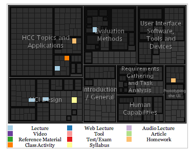
This library and web portal contains material useful for undergraduate and graduate education in Human-Centered Computing, Human-Computer Interaction and related areas. Its contents consist of a variety of materials, including PowerPoint lectures, class syllabi, videos, example projects, exams, homework assignments and more.
One of the interesting aspects of this library is that everybody can contribute to the contents. Also the search functions shows the results with a nice visualization that help understanding the content of the query results linking the results list with the compartments of the library in which each particular content was filled.
![]() Tags: education, information visualization, pedagogy, research
Tags: education, information visualization, pedagogy, research
Perché una società vada bene
“perché una società vada bene, si muova nel progresso, nel’esaltazione dei valori della famiglia, dello spirito, del bene, dell’amicizia, perché prosperi senza contrasti tra i vari consociati, per avviarsi serena nel cammino verso un domani migliore, basta che ognuno faccia il suo dovere.”
Giovanni Falcone
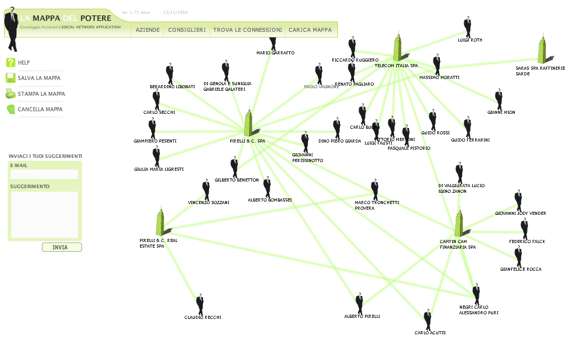
Italian Power Map
There exist an Italian version of the Power Map I blogged a couple of months ago. It is pretty interesting to see relationships between business men. There are lots of transactions happening between companies with shared board members. I think that tools like this one should be used daily from the internal revenue services. Below an example of application: I tried to show the connection of Marco Tronchetti Provera, ex CEO of Telecom Italia. At the time he was Chief Executive Officer, he was also in the board of Pirelli Real Estate. He sold many pieces of real estate from Telecom Italia to Pirelli. As Beppe Grillo would say: “He did not even had to call himself to make the deal!”.
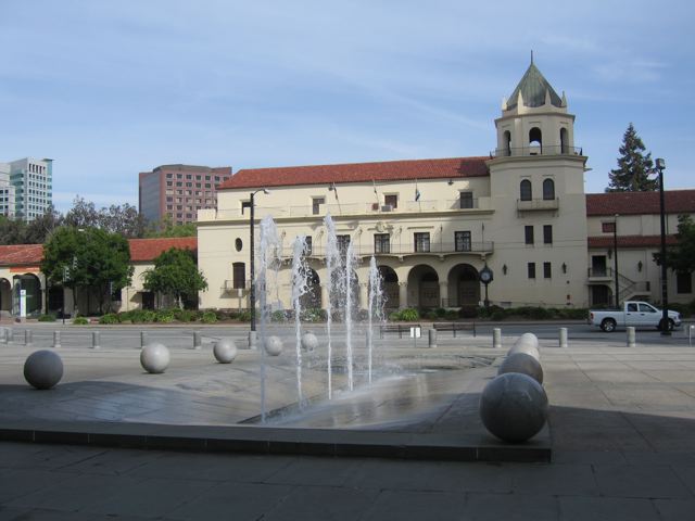
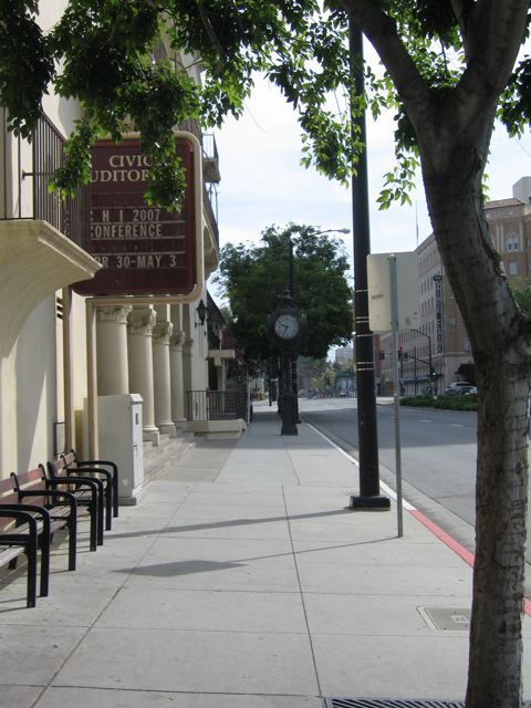
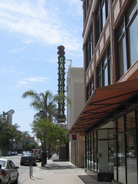
Walking in San Jose, downtown
Trying to recover from the jet lug I took a walk in San Jose (CA) downtown. The city seems to be relaxed and cosy.


![]() Tags: chi2007
Tags: chi2007
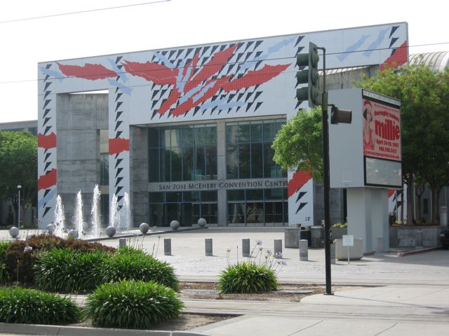
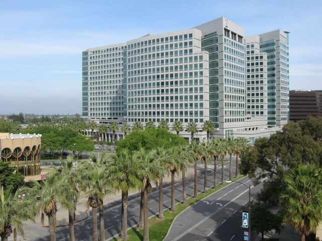
Off to CHI
After a trip of almost 24 hours I am in San Jose (CA) for presenting the work I did this summer at Microsoft Research on how and why developers draw code. I will be posting soon the slides and the some more details of the publication. In the mean time a couple of pictures I took during the flight. First the silhouette of the Boeing 747-400, one of the best airplanes of all times.


Then, of course, the welcoming endless cue of the US immigration. A -sad- side note, they took my prosciutto because they say that it is forbidden to import meat … as if prosciutto could injury somebody …
Anyway, I am happy to be here. Silicon Valley and the Bay Area seems to be a nice place to hang out a couple of days.
![]() Tags: chi2007
Tags: chi2007
Analyzing eye-gaze sequences in computer-mediated-communication
Premise: to have an idea of the experiment that I am currently analyzing, refer to this technical report.
These days I have been working on creating a meaningful visualization for the eye-gaze sequences that we collected in my current experiment on collaborative problem solving at distance. As explained in my previous post, the initial step to present the huge amount of data that we collected in a meaningful way consisted in constructing a time-series of the time intervals of editing of the utterances produced and the icon movements across the work area.
This time-series per se is interesting to compare different experimental conditions. However, does not explain what the peers were doing during the editing of the messages. To introduce this information, I used the eye-tracker data dividing the work area in top-level polygons: the map area; and the chat window, which was subdivided in history pane and composition pane. I mapped these three polygons to the basic activities of: identifying (map), reading (history), and writing (composition box).
Then I aggregated the eye-gaze data in sequences of permanence into one of these areas. Then, given the start time and the end time of each sequence I could complete the time-series superimposing a timeline visualization of these three basic activities.
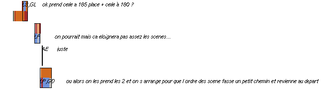
An excerpt of the resulting image is shown below. Brown color represent the identifying activity, red is reading and blue writing. For each utterance I report the activities of both peer using the upper line for participant 1 and the lower line for participant 2. What emerges at a first glance is that during the message composition there is an high probability that the eye will jump on the map and on the history whenever the message utilizes geographical references.
In other words, whenever the message composition requires a geographical encoding of information which are taken from the context (previous messages and / or shared landmarks), the eye checks these information along the editing of the message that should transmit this information. In the sequence of the 4 messages reported below, the last one shows exactly this phenomena: while the first participant is busy exploring the map the other is composing a proposition in which s/he acknowledge the choice of the two parking introduced by the first participant in the first utterance of the sequence, and s/he also introduce an extra arrangement of the scenes based on this selection. At the beginning of the message composition, the eye quickly glance at the history, looking for the confirmation of the parking labels (185 and 180), then quickly at the map looking for the path between the parking lots and the stages. Finally s/he spends the remaining time in the message composition window.
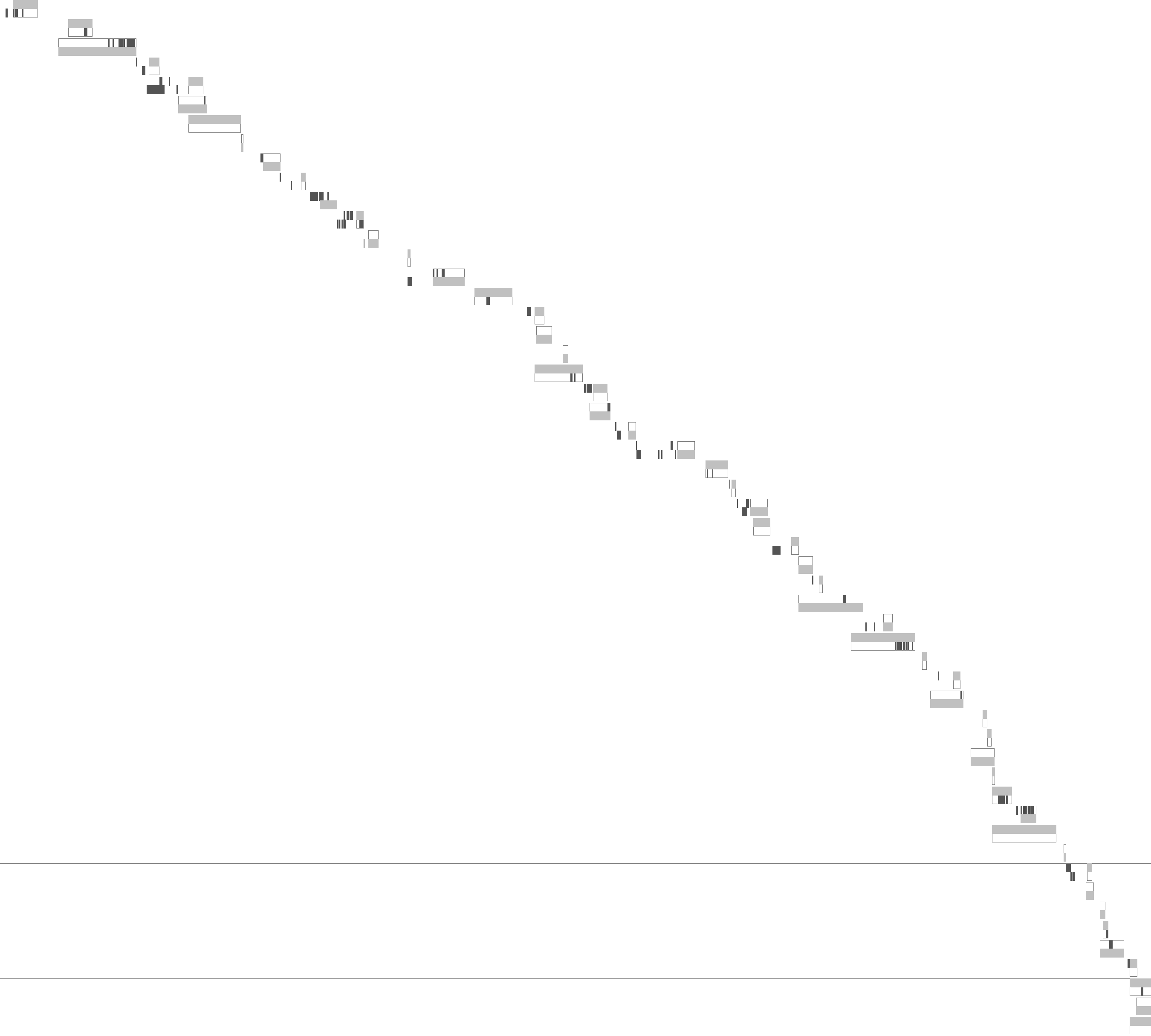
Time-Series and Eye-Tracking Analysis of Interaction
This Friday, I have been playing with some visualizations for my current experiment. The main point is to understand the sequence of actions between the two players trying to organize a concert on distance using a shared map and a chat application. My objective was to show the sequence of actions that brought the pair to reach a certain solution. In the concert experiment I organized there are three types of events: utterances, icon movements, and evaluations of score. Also the activity is not constrained in any way so that the player are free to any of these events at any point in time.
(1) The first goal of my visualization was to show the parallelism of actions between the two players: where there any concurrent actions happening in a micro sequence of the task?
(2) The second point was to show action fragmentations: how many icon movements were performed during the same sequence of interaction?
(3) The third point was to show participants cognitive alignment, superimposing to this information eye-movements registered using the eye-trackers, to answer questions of the kind: do participant B looked at A’s message before performing his/her subsequent actions?
Somehow I was trying to combine Gergle et al. [1] visualization techniques. He used a timeline display to show parallelism ad a time-series to show the sequence of actions in his experiment of a pair in a collaborative problem solving (see the pictures below).
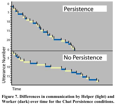
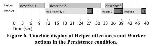
Somehow I was trying to combine these two techniques in a comprehensive visualization. So, I came out with an initial prototype which answer the first two points above. Each line in the series represent a sequence of interaction between the two participants the upper part is reserved to participant A, while the lower part is for participant B. light gray shows the time of composition of a message, while dark gray shows the movements of the icons. Horizontal lines show the score evaluations that were launched during the game. The horizontal axis of the graph represents time (the experiment lasted 45 minutes). The vertical axis starts on the top-left corner and it represents the utterances produced during the interaction.
Reference
[1] D. Gergle, D. R. Millen, R. E. Kraut, and S. R. Fussell. Persistance matters: Making the most of chat in tightly-coupled work. In Proceeding of CHI2004, pages 431–438, Vienna, Austria, April 24-29 2004. ACM Press. [url]
![]() Tags: Computer Supported Collaborative Work, context, controlled experiments, eye-tracking, human computer interaction, information visualization, research, research methodology
Tags: Computer Supported Collaborative Work, context, controlled experiments, eye-tracking, human computer interaction, information visualization, research, research methodology
Culture of death
…
In fact, while the climate of widespread moral uncertainty can in some way be explained by the multiplicity and gravity of today’s social problems, and these can sometimes mitigate the subjective responsibility of individuals, it is no less true that we are confronted by an even larger reality, which can be described as a veritable structure of sin. This reality is characterized by the emergence of a culture which denies solidarity and in many cases takes the form of a veritable “culture of death”. This culture is actively fostered by powerful cultural, economic and political currents which encourage an idea of society excessively concerned with efficiency.Looking at the situation from this point of view, it is possible to speak in a certain sense of a war of the powerful against the weak: a life which would require greater acceptance, love and care is considered useless, or held to be an intolerable burden, and is therefore rejected in one way or another. A person who, because of illness, handicap or, more simply, just by existing, compromises the well-being or life-style of those who are more favoured tends to be looked upon as an enemy to be resisted or eliminated. In this way a kind of “conspiracy against life” is unleashed. This conspiracy involves not only individuals in their personal, family or group relationships, but goes far beyond, to the point of damaging and distorting, at the international level, relations between peoples and States.
…
Encyclical Letter Evangelium vitae, 25th March 1995
If any man would come after me
“If any man would come after me, let him deny himself and take up his cross and follow me” (Mt 16:24).
John Paul II, Good Friday evening, 2000